

Deadly Series: Striking with Precision

Research and Concept Development
We began with an in-depth research phase, looking closely at the snakes themselves. The Viper’s reputation for speed and accuracy, the Striker’s aggressive precision, the Sidewinder’s stealth and unpredictability, and the Copperhead’s venomous strike all offered rich creative cues. We studied their physical characteristics, from the wide or narrow shape of their heads to their coloration and hunting behaviours, to translate these traits into visual design elements.
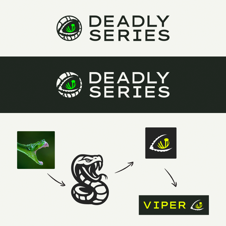
The early design explorations included detailed snake illustrations, experimenting with full-body renderings and dynamic poses. While these designs captured the essence of each snake, we quickly identified a challenge: full snake illustrations lacked the flexibility and adaptability we needed for a scalable product identity. Over time, our iterations became more refined, shifting focus to the snake’s head, then ultimately honing in on a single, striking detail, the eye.
Logo Design Evolution
The decision to focus on the eye as the defining mark of the Deadly Series was deliberate. The eye is universally associated with focus, precision, and intent, all qualities that align with the purpose of an arrow in flight. This visual shorthand allowed us to create a simple yet powerful logo mark for each arrow in the series.
We designed the overarching Deadly Series logo to be bold and adaptable, supported by four individual arrow logos, each featuring a distinct snake-eye motif. This approach created a consistent brand family while allowing each arrow to retain its individuality. The snake-eye design could scale across everything from arrow shafts to marketing materials without losing clarity or impact.
Color Strategy
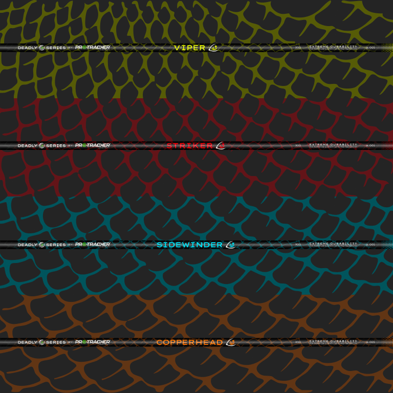
Color was a central pillar of the rebrand. The functional requirement for the arrows to be visible in the field guided our choice to use day-glow colors. Each arrow’s palette was informed by both its snake namesake and the need for high-contrast visibility.
The Viper took on an Acid Yellow palette for its aggressive, high-visibility punch. The Striker adopted a Blood Red tone, symbolising lethal precision. The Sidewinder embraced a Bright Blue, evoking speed and stealth. The Copperhead featured Flame Orange, a nod to its namesake’s warm, warning hues. Each palette was supported by pure black and white for contrast, as well as custom gradients transitioning from black through the arrow’s primary color and back to black, creating a dynamic sense of motion.
At the brand level, the Deadly Series maintained a shared primary palette including Off Black, Off White, and Pro-Tracker’s Vivid Green. This ensured a seamless connection to the parent brand while giving each arrow its own visual impact.


Pattern Development
To strengthen the visual link to the snakes, we developed a custom snakeskin pattern to be applied across the arrow designs and supporting materials. This was not a generic texture pulled from stock; it was a handcrafted pattern built from extensive reference research into the unique scale structures of each snake species. The pattern had to work at both macro and micro scales, detailed enough to be interesting up close, but simple enough to reproduce clearly on curved surfaces like arrow shafts.
The snakeskin pattern was designed to work in concert with the color gradients, subtly applied at 25% opacity to create depth without overpowering the bold arrow colors. This approach added a tactile, premium feel to the arrows while reinforcing the thematic link between product and predator.
Typography and Supporting Elements
Typography played a key role in unifying the series under a single design system. We selected Lexend as the primary typeface for body copy, chosen for its clarity and accessibility in print and on-screen. For moments of emphasis, such as arrow names, packaging titles, and promotional headers, we used Lexend Zetta, an extended, bold variant that added impact while maintaining visual consistency.
The typography system was designed to be as functional as it was distinctive. Arrow names were always presented in uppercase for emphasis, paired with the relevant snake-eye logo, creating a lockup that was instantly recognisable in both retail and online contexts.
Application Across Mediums
The Deadly Series rebrand was an exercise in balance, combining bold individuality for each arrow with the cohesion of a unified product line. By focusing on the defining characteristic of the snake and the eye, we distilled a complex visual narrative into a simple, versatile, and instantly recognisable system. The handcrafted snakeskin patterns and day-glow color palettes gave each arrow a personality rooted in its namesake, while ensuring the designs were practical and functional in real-world use.
.svg)
“We needed a new direction and Teton Marketing Labs came in with a clear action plan and started work right away. Their work has exceeded our expectations.”
