Steel Vision: A sharper identity for a builder that's exact down to a fraction of an inch.
The challenge
The previous identity had equity but not enough bite. The “eye” motif was inconsistent, typography felt soft at distance, and there were no clear rules for color, scale, or digital use. The brief was direct, create a mark that reads instantly in the field, unify the system, and make it easy for internal teams and suppliers to use correctly.
Our approach
We ran a discovery session to understand history and needs followed by a three-round creative design process. Round one explored four distinct routes so the client could judge brand direction, not only style. Possibilities included refined heritage marks to a playful emblem utilizing steel beams to a modern wordmark with the O doubled as a foundry ladle. Steel Vision asked for a harder typographic stance and a clearer "eye" in the O, which we pushed through routes two and three, testing weight, spacing, and symbol clarity across different situations.
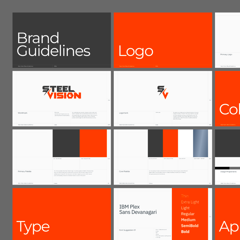
Logo, wordmark, and symbol
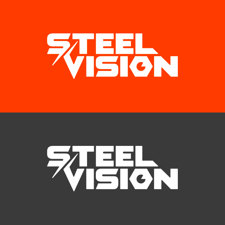
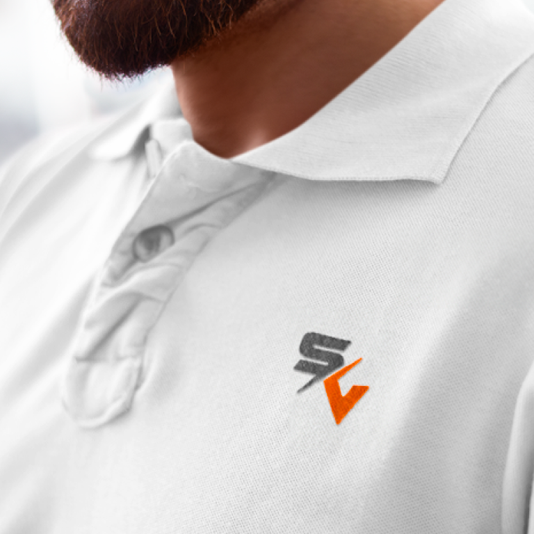
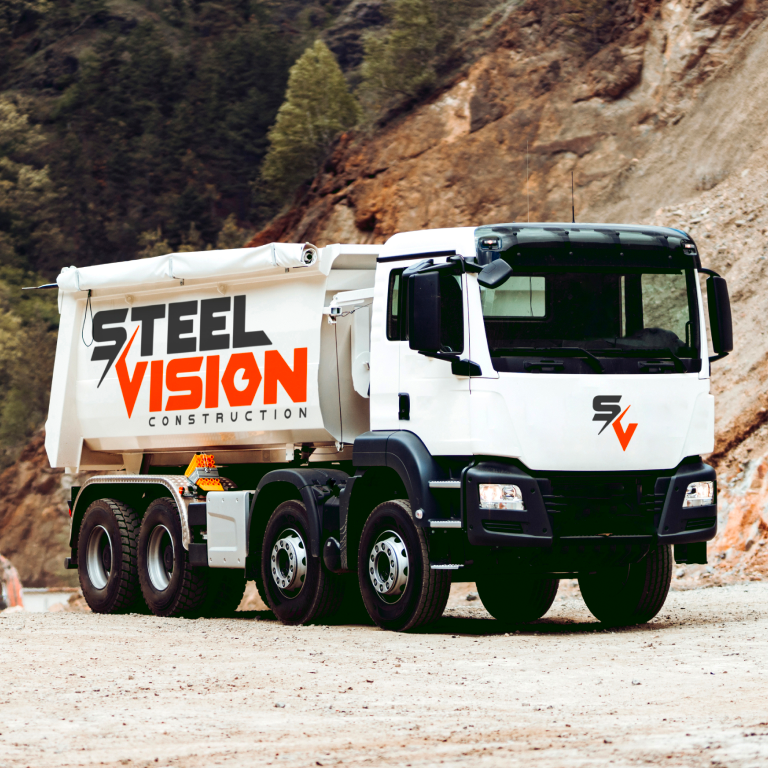
The approved wordmark uses bold block capitals with angular cuts that telegraph toughness and accuracy. The logomark interlocks S and V into a distinctive, angular emblem. Inside the O, an icon merges an eye with a hex nut, a concise fusion of foresight and fabrication. The guidelines define how the combined lockup, the standalone mark, and the icon work together, with scale minimums for mobile and desktop so the logo stays crisp on screens and on site. Misuse rules prevent stretching, weight swaps, or duplicate symbols inside a boundary.
Color
Steel Vision now owns their own Vision Orange and Dark Grey, supported by a cool steel gradient. The guidelines establish primary and supplemental color palettes so communications feel energetic, legible, balanced, and accessible—not just loud for the sake of it.
Type
IBM Plex Sans carries headlines, body copy, and interface labels across weights. It is strong, safe, and modern, and is separate from the custom wordmark.
Applications
Layout references help this new branding system transfer well to documents, apparel, vehicles, and signs. This turns guidelines into a working kit to simplify future branding needs and remove the guesswork.
Why it matters on site and online
Construction brands live in motion. Signage must read from a distance, vehicles act as moving billboards, and bids are scanned on mobile. The Steel Vision system was engineered for those realities. High contrast, strict scale guidance, and simple lockups protect legibility anywhere the mark appears.

Outcomes
As the new branding rolls out, the early signals have been strong. There has been improved recognition, one-off and mismatched designs fixes have dropped, and document cohesiveness for clients and suppliers has improved. The identity feels like a single piece of engineering rather than a logo with bolt-on parts.
What Steel Vision received
- Primary, stacked, and responsive logos, plus an S-V logomark and the eye-in-nut icon
- A color system with values, contrast guidance, and usage proportions
- A typography stack for print and digital, separate from the logo
- Clear rules for scaling and misuse, with real-world applications.
For Mountain West owners
If your logo breaks at small sizes, if trucks and helmets show different colors, or if proposals feel inconsistent, you are paying an invisible tax. The Steel Vision refresh shows how a pragmatic system creates clarity and confidence. Teton Marketing Labs helps regional builders, trades, and manufacturers get the same advantage with brand identity, logo and symbol design, guidelines, templates, and rollout support.
Ready to make your brand work as hard as your crews? Let’s build it right.

"Our old branding was feeling very dated going into 2024. We needed to stand out in a competitive construction field. Working with Teton Marketing Labs really got the creative juices flowing and I'm very happy with where we landed. We're now implementing it everywhere."